coursework ♡

Thursday 4th May 2023 Coursework
LO - to explore possible tasks and research similar products.
Brief 1: Health and fitness magazine
Pros - can be done in lesson, only pictures needed (no videos)
Cons - lots of hard work and concentration needed, needs to be strategically done.
Brief 2: music video (not giving up)
Pros - would work very nicely, it'd be trying something new
Cons - lots of effort, needs lots of planning, has to be done outside of school, no actors to be in it.
Brief 3: Health and fitness website
Pros - easier than the other two, most interesting to me, i know i'm not going to struggle too much.
Cons - need at least 3 pictures and a 45 second video that i have to film.
Thursday 18th May 2023


- Each website has large titles, a link to a support system, a search bar, very clear subtitles
- 3 of them have images of happy smiling people, very diverse models with subtitles under each picture
- For 3 of the 4 websites, white is the main colour with splashes of one accent colour
- Usually the logo is part of the title or website name and will in some way relate to the idea of health.
- each one has a menu bar that makes it easier to access the rest of the website, the pages often in the menu bar are often care and support or advice based.
- the font is blocky for each page
Website general codes and conventions - Main Navigation, Content Hierarchy, Using a Grid, Link Styling, Buttons, Colours
Thursday 8th June 2023 Coursework planning
LO - to plan an effective product aimed at a specific audience using appropriate codes and conventions.
Magazines
- colour scheme of black/white, light colours
- blocky text thats easy to read and stands out
- images taken at a midshot or medium longshot
- context of healthy habits, fitness, eating healthy
- cover having a midshot image of someone in the target audience age range
Website planning
- focus on fitness // athletic achievers // fantastic fitness //
- aim to get teens excited for exercise and taking care of their bodies to remain healthy
- style - colour scheme of black and white with splashes of bright colours here and there to give off a positive mood/theme.
- get into it // fuel your fitness // a healthy body is a happy body
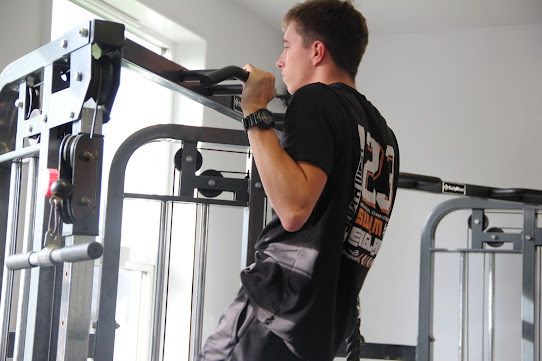
- image ideas - 2 pictures of easy workouts for teens to stay in shape, 1-2 pictures of healthy food/snacks that teens can make (healthy alternatives to unhealthy foods)
-
Thursday 22nd June 2023 Adobe Illustrator
LO - explore the use of adobe illustrator to create a magazine masthead or logo.

Thursday 22nd June 2023
Target Audience
- teens (14-18)
- females and males
- stressed because of school
- interested in healthy options for food
Thursday 6th July 2023 In-Design
LO - to explore and understand how to use InDesign for magazine layouts.


Thursday 13th July 2023 Production
LO - to create content that meets the set brief by creating meaning for an audience of 14-18 year olds.
Here at fuel we understand that sometimes you don't want to come home after a long day just to spend lots of time, money and effort cooking something healthy, or maybe you just really want that fast food. we cant blame you. However, you will definitely not regret trying some of these amazing, healthier alternatives to unhealthy food that's full of fat and sugar.
Year 11
Thursday 7th September 2023 Statement of Intent
LO - to produce a concise and clear statement.
My brief Is to make a health and fitness website for a target audience of 14–18-year-olds who want tips on a healthier lifestyle, specifically what a healthy diet looks like and healthy alternatives to unhealthier eating habits. I chose the name “FUEL” for my website because it’s all about fuelling your fitness and choosing foods that make you feel healthy physically, mentally and socially.
My aim is to make sure people are aware of how much diet affects your health. I plan to keep the theme of the website very simple and easy to navigate, my colour pallet and website design will be neither masculine nor feminine, this is to make sure everyone feels welcome to have a look and talk to friends about it too.
Each health and fitness website that I researched had 2-3 main colours and used sans serif fonts for most of the writing/titles, I will be doing this as well.
For my 45 second video I will be making a timelapse of me making a healthy smoothie or healthy and easy to prepare lunch.
Thursday 14th September Coursework Review
LO - to recap brief criteria and explore how to create effective representations.

How is your homepage going to follow the layout/content conventions of a homepage?
- my homepage is going to follow the layout and content conventions of a homepage. i will have a menu/navigation bar at the top of the homepage with my original logo next to it in simple colours (yellow, grey and white).
what is your linked page going to be about and how will it be laid out?
-im going to make a linked page featuring 3 or more pictures, some with healthy food options and how to instructions on how to make them cheaply, also some with easy to follow exercises (yoga..?).
How will the genre of your website be made clear over both pages?
- i will make sure that the colour scheme and genre stay very unisex to make sure that anyone feels that they can partake in the activities advertised in my website. i will not aim anything at males or females and will make sure everyone feels supported to do whatever they enjoy.
To Do
- choose wix template
- plan and take photos
- write up text
Thursday 21st September 2023
Thursday 4th October 2023


Thursday 12th October 2023


RESEARCH:
ReplyDeleteSome research, both analysis missing
TA PROFILE:
missing
PLANNING:
A good start - which logo design are you using?
I'd like to see more about your representations.